


10 Essential Electronic Music Albums of the 1980s — and the Graphic Design That Defined Them
The electronic music of the 1980s did not arrive with a single visual language. It arrived through several competing versions of the future, some immaculate and corporate, others romantic, industrial, anonymous or deliberately strange, while the technology producing the music moved rapidly from expensive studios toward increasingly accessible synthesizers, drum machines, samplers and computers.
Look across the decade and the familiar clichés of “electronic design” begin to fall apart. There are grids and geometric typography, certainly, but there are also roses, paintings, architectural spaces, manipulated portraits, scientific imagery and covers whose restraint borders on anonymity. The machine did not dictate one aesthetic; instead, electronic musicians and graphic designers repeatedly had to decide what a sound without an obvious physical source should look like.
These ten records are not simply a ranking of the decade's biggest electronic albums. They represent different moments in the relationship between electronic music and graphic design, showing how photography, typography, art direction and emerging digital technology helped construct identities around music that was itself constantly being reinvented.
1. Kraftwerk — Computer World (1981)
By 1981, Kraftwerk no longer needed to explain their relationship with machines, which makes Computer World interesting because its cover moves away from the romantic image of futuristic technology and toward something closer to a product interface.

A yellow-green field surrounds a terminal displaying simplified portraits of the group, while the album title appears with the blunt clarity of information intended to be read rather than admired. The computer is not hidden behind abstraction; it becomes both subject and frame.
What now looks charmingly primitive was once an image of contemporary technological anxiety and possibility. Personal computing was entering public consciousness, databases were expanding and the idea that identity itself could become information was beginning to feel less like science fiction.
The cover captures this beautifully because the members of Kraftwerk have effectively been translated into data. Their photographic bodies disappear, replaced by crude digital likenesses displayed by the machine, anticipating a visual condition that has since become completely ordinary: the human face as information on a screen.
From a graphic-design perspective, the apparent simplicity is deceptive. The limited palette, symmetrical terminal and reduced portraits establish an identity capable of surviving across sleeve, typography and stage presentation, while the technology is represented through the visual limitations of technology itself. The pixels are not decoration. They are the subject.
2. Depeche Mode — A Broken Frame (1982)
If Computer World presents electronic music through the computer, Depeche Mode's A Broken Frame does almost the opposite, using an image that could easily belong to another century.

Brian Griffin's photograph depicts a woman working in a field with a scythe, surrounded by an atmosphere closer to European pastoral painting than the emerging visual language of synthesizer pop. The tension between image and sound is precisely what makes the sleeve memorable.
There is no requirement that electronic music must look technological.
That sounds obvious today, but it remains one of the most important lessons in album-cover design. Genre provides designers with a library of recognizable signals, and those signals can quickly become restrictions. A synthesizer record can acquire chrome lettering, grids, circuitry and computer imagery simply because those things communicate “electronic” efficiently.
The result demonstrates how contrast can establish identity more effectively than agreement. Music created with modern electronic instruments is placed behind an image of manual agricultural labour, while the highly constructed photograph itself resembles something found rather than staged. The cover does not illustrate the record's technology'
It creates another world for it to inhabit.
3. New Order — Power, Corruption & Lies (1983)
Few album covers demonstrate the independence of graphic design from genre more clearly than Peter Saville's artwork for New Order's Power, Corruption & Lies.

At its centre is A Basket of Roses, a nineteenth-century painting by Henri Fantin-Latour, an image whose relationship to electronic music initially appears almost nonexistent. Beside it sits a colour-coded system developed by Saville, allowing textual information to be translated into blocks whose rational logic contrasts sharply with the sensuality of the flowers.
The cover therefore contains two historical moments at once. The painting belongs to the museum, while the code suggests information technology, systems and machine-readable communication. Instead of trying to reconcile them visually, Saville allows the contradiction to remain visible.
This was particularly appropriate for New Order, whose music was itself negotiating tensions between post-punk instrumentation and increasingly electronic production. The sleeve does not illustrate that transition literally, but it behaves similarly by forcing apparently incompatible languages into the same object.
It also demonstrates how a record label can build identity without placing a giant logo on every release. Saville's work for Factory Records established recognition through decisions about information, reproduction, typography and cultural references rather than through conventional branding. The roses became electronic precisely because they should not have been.
4. Art of Noise — Who's Afraid of the Art of Noise? (1984)
The Art of Noise approached electronic music as a collision of sampling, technology, pop culture and conceptual provocation, so it makes sense that their visual identity emerged from the equally constructed world of ZTT Records.

The cover avoids the conventional glamour of mid-1980s pop and instead participates in ZTT's broader fascination with manifestos, codes, catalogue systems and the language of institutions. The record feels like part of an organization whose exact purpose is never completely explained.
This becomes especially relevant when considered alongside sampling. The Fairlight CMI allowed sounds to be recorded, fragmented and reorganized into new contexts, challenging older distinctions between performance, recording and composition. Graphic design around the group behaved similarly, appropriating cultural language and reorganizing information until advertising, philosophy and parody became difficult to distinguish.
The important connection is not that the cover somehow “looks like sampling.” It is that both the music and the visual identity are constructed through recontextualization.
That idea would become increasingly important as digital technology changed both disciplines.
5. Jean-Michel Jarre — Zoolook (1984)
Zoolook gives us one of the decade's strangest electronic portraits, with Jean-Michel Jarre's face split into two radically different visual states.
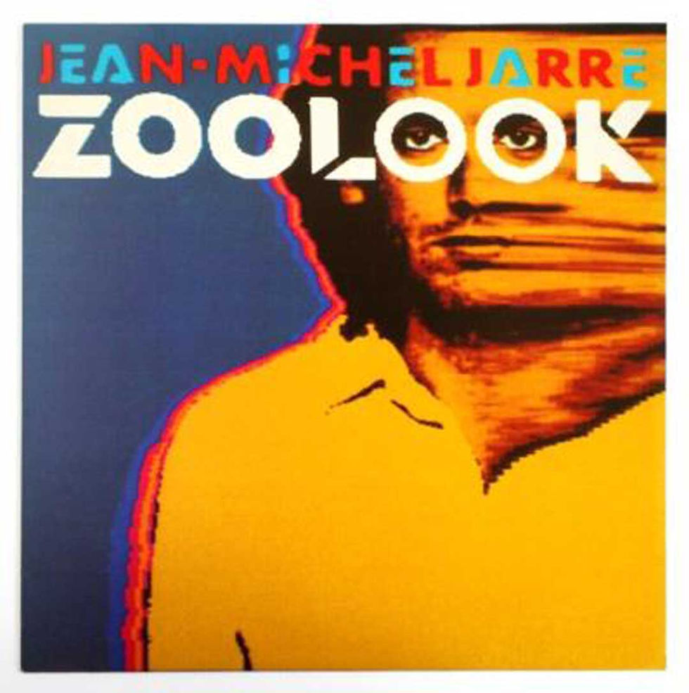
One side remains recognizably photographic while the other becomes an artificial network of colour and pattern, creating a hybrid face that sits somewhere between human being, mask and machine.
The image is particularly appropriate for a record constructed extensively from sampled and manipulated human voices. Jarre recorded vocal material from numerous languages and transformed those fragments electronically until speech could function as texture and rhythm rather than simply language. The cover performs an equivalent operation on the face.
Rather than removing the human element, technology reorganizes it.
This is an important distinction because electronic imagery is frequently imagined through the replacement of the human body by machines, while Zoolook proposes something more ambiguous: the body remains visible but has become available for technological transformation.
In the mid-1980s, that hybrid carried a genuinely futuristic quality. Today, after decades of Photoshop, filters, face tracking and generative imagery, the manipulation feels almost prophetic. The question has remained surprisingly stable. At what point does an altered portrait stop documenting a person and begin designing one?
6. Yellow Magic Orchestra — Technodelic (1981)
Yellow Magic Orchestra deserve a place here not simply because of their importance to electronic music, but because their visual culture demonstrates how unstable the relationship between technology and nationality had already become by the beginning of the decade.
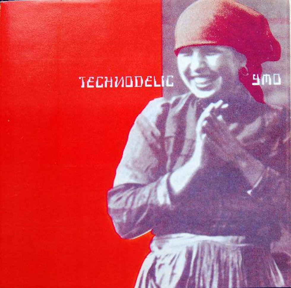
Technodelic arrived during a period in which YMO were experimenting extensively with sampling and electronic production, yet the cover avoids reducing technological identity to the obvious imagery of computers and synthesizers.
Its controlled photographic and typographic treatment belongs to a broader YMO visual world in which fashion, consumer technology, Japanese modernity and Western ideas about futurism were continually being reflected back at one another. This matters because much of the standard history of electronic graphic design is told through Düsseldorf, Manchester, Sheffield, Detroit and later Berlin. Tokyo complicates that story.
Electronic music was already international, and its visual language developed through different relationships with consumer electronics, advertising, fashion and graphic modernism depending on where the music was being made. The electronic future was never exclusively European.
Its graphic design shouldn't be remembered that way either.
7. Laurie Anderson — Big Science (1982)
Laurie Anderson's Big Science sits somewhere between electronic music, performance art and conceptual storytelling, and its cover refuses the theatrical excess one might expect from an artist whose work could involve altered voices, invented instruments and multimedia performance.

Instead, the sleeve uses portraiture with a restraint that makes the image feel slightly displaced from ordinary pop photography. Anderson is present, but the visual identity does not attempt to turn her into a conventional star.
That distance is appropriate to a record fascinated by technology, communication and modern American life, where familiar systems become strange simply by being observed closely enough.
The design shares that quality. Rather than visualizing the future through spectacle, it allows a relatively controlled image to become unsettling through context, demonstrating again that electronic music did not require a universally futuristic graphic style.
Sometimes the most effective way to represent technological culture is simply to make the familiar feel unfamiliar.
8. Pet Shop Boys — Actually (1987)
By the second half of the decade, electronic production had moved decisively into mainstream pop, and Pet Shop Boys developed one of the most controlled visual identities around it. The cover of Actually is almost provocatively uneventful.

Chris Lowe looks toward the camera while Neil Tennant yawns beside him, producing an image whose apparent casualness contrasts with the immaculate construction normally expected of major-label pop photography. The brilliance lies in refusing spectacle.
By 1987, pop album covers could exploit elaborate studio photography, retouching and increasingly sophisticated graphic production, yet Actually derives its identity from an anti-performance. The musicians do not appear heroic, mysterious or sexually available; one of them appears bored.
That understatement became an important component of Pet Shop Boys' visual culture, particularly through their long relationship with designer Mark Farrow, where typography, photography and packaging were frequently treated with a conceptual precision closer to contemporary art publishing than conventional pop branding.
The cover reminds us that art direction is not synonymous with adding things.
Sometimes the decisive intervention is choosing the photograph everyone else would have rejected.
9. 808 State — Ninety (1989)
By the end of the decade, electronic music was moving into a new environment shaped by acid house, rave culture, affordable sampling and increasingly powerful digital production, and the visual language surrounding it began changing accordingly.
808 State's Ninety belongs to that threshold.

The sleeve feels removed from the carefully staged celebrity photography dominating much of the decade, moving instead toward a graphic language in which abstraction and design can carry the identity without requiring the musicians themselves to occupy the cover.
That shift would become enormously important during the 1990s.
As electronic music increasingly circulated through DJs, independent labels, twelve-inch singles and club culture, the face of the performer became less necessary. Labels and designers could build recognition through symbols, typography, catalogue numbers and systems whose relationship with traditional celebrity culture was deliberately weak.
Ninety therefore belongs not only at the end of an electronic decade but at the beginning of another visual era.
10. Aphex Twin — Selected Ambient Works 85–92
There is a slight problem here, and it is precisely why I would include it as an epilogue rather than pretend it belongs chronologically inside the 1980s. The music on Richard D. James's Selected Ambient Works 85–92 reaches back into the late 1980s, but the album itself was released in 1992.

Its famous cover reduces identity to the Aphex Twin symbol against a textured field, with neither portrait nor conventional illustrative narrative required to establish the record's world.
Placed after the other covers, it shows where several tendencies of the 1980s were heading. The computer no longer needs to appear as an object, as it does on Computer World. Electronic music no longer needs the manipulated human face of Zoolook, nor even the conceptual portraiture of Pet Shop Boys.
The transition into the 1990s would increasingly make this kind of anonymity possible, particularly within techno, ambient, IDM and independent electronic labels where visual identity could belong as much to a label, catalogue or graphic system as to the individual musician.
In that sense, the 1980s did not produce a definitive graphic language for electronic music. They made it possible for the following decade to stop needing one.
The 1980s Never Had One Electronic Look
Looking across these records reveals why describing an “1980s electronic aesthetic” is ultimately misleading.
Kraftwerk placed the human face inside a computer terminal, while Depeche Mode photographed agricultural labour. Peter Saville put nineteenth-century flowers on New Order, Zoolook transformed a human portrait through technological imagery, Pet Shop Boys made boredom into art direction, and the emerging dance culture at the end of the decade increasingly discovered that musicians did not need to appear on their records at all.
Electronic music separated sound from many of the physical sources through which music had traditionally been understood. A synthesizer could create a tone without an obvious acoustic equivalent, a sampler could remove sound from its original context and a sequencer could organize performance through systems that no longer required musicians to be visibly playing together.
Graphic design was confronted with the same freedom. Once the album cover no longer needed to show a band with guitars, almost anything could occupy the square: a computer, a flower painting, a manipulated face, an anonymous photograph, a symbol or nothing more than carefully organized information.
Written by Otávio Santiago, a multidisciplinary designer exploring the intersection of emotion, form, and technology. His practice spans graphic, motion, and 3D design, bridging digital and physical experiences.




Comments