


Five Björk Album Covers Where Graphic Design Became World-Building
Björk has rarely treated an album cover as the final image attached to a finished record. Across more than three decades, her releases have operated more like temporary worlds in which sound, photography, fashion, typography, technology and mythology are developed together, sometimes so completely that separating the musician from the visual character surrounding her becomes almost impossible.
This makes her discography particularly interesting from a graphic-design perspective. The covers do not share a logo, a permanent typeface or an immediately recognizable layout, yet they remain unmistakably connected because each album develops its own visual logic with unusual consistency. A new record can mean a new body, new materials, new technologies and even a different relationship between the human figure and the image.
That approach also traces a history of image-making itself. Photography gradually becomes digital construction; the album sleeve expands into interactive software and virtual reality; typography behaves less like information and more like an organism; costumes move from fashion into sculpture, while technologies normally hidden inside production become visible parts of the artwork.
Five albums make that evolution particularly clear: Homogenic, Vespertine, Biophilia, Vulnicura and Utopia. Together, they reveal an artist for whom graphic design is not there to explain the music after it has been made, but to participate in constructing the mythology around it.
Homogenic: Building a Human Who Could Not Quite Exist
The figure on the cover of Homogenic appears immediately recognizable as Björk, yet almost everything about the portrait works against the familiarity of a conventional celebrity photograph. Her body is rigidly symmetrical, her skin has an almost synthetic smoothness, her hair rises into an architectural structure and the costume designed by Alexander McQueen transforms her shoulders into an exaggerated silhouette that seems simultaneously ceremonial, historical and futuristic.

Photographed by Nick Knight, with art direction and design by Me Company, the 1997 image belongs to a particularly interesting moment in visual culture when physical image-making and increasingly sophisticated digital post-production were beginning to merge almost seamlessly.
What makes the cover compelling is that its artificiality cannot be located in a single technique. The transformation begins physically, through costume, hair, makeup, pose and lighting, before digital manipulation pushes the photograph further away from documentary portraiture. Rather than using software to create spectacle from nothing, the production constructs an elaborate physical subject and then allows digital technology to complete the transformation.
The result is often described through its mixture of Japanese, futuristic and warrior-like references, although the image resists belonging cleanly to any particular culture or period. This ambiguity is important. Homogenic was conceived around collisions—electronic beats against Icelandic strings, technological precision against geological force—and the cover develops a corresponding visual tension between human body and constructed object.
Graphic design enters by controlling those contradictions rather than resolving them. Symmetry gives the image the authority of an icon, while the impossible styling prevents the portrait from becoming stable. Björk is positioned almost like a deity from a mythology whose historical period has never existed.
In this sense, Homogenic demonstrates something that would become increasingly important across her later work: technology is most interesting when it does not simply look technological. The computer is not represented through circuitry, pixels or interfaces; it is present in the possibility of constructing a body that exists somewhere between photography, fashion and digital image.
Vespertine: When Technology Became Intimate
Four years later, Vespertine almost dissolves the monumentality of Homogenic. The rigid frontal figure disappears into a pale, layered image in which Björk's body, a swan, handwriting and delicate graphic marks seem to occupy the same fragile surface.

The photograph was made by Inez van Lamsweerde and Vinoodh Matadin, while the sleeve was designed with M/M (Paris), whose contribution helped turn the portrait into something that feels drawn upon, written through and partially erased rather than simply reproduced.
The shift corresponds closely to the technology of the record itself. Vespertine was created around small, intimate sounds, including microbeats, domestic recordings and electronic details whose scale contrasts dramatically with the enormous orchestral gestures associated with Homogenic. Rather than presenting technology as something metallic or futuristic, the album makes digital production feel private, tactile and almost secretive.
The cover does something similar.
Its white space does not function as conventional minimalist emptiness because the image remains full of faint information. Lines overlap the photograph, handwriting crosses the surface and the swan's white feathers merge with Björk's clothing until figure and background begin to lose their boundaries. The design rewards proximity in much the same way that the music rewards close listening.
The swan introduces another layer. Across European mythology and folklore, swans carry associations with transformation, sexuality, purity and the unstable boundary between human and animal, from Leda and the Swan to the recurring figure of the swan maiden. Björk's infamous Marjan Pejoski swan dress had already turned the bird into part of her public image, but on Vespertine the relationship becomes quieter and stranger, with the animal appearing less like a costume than a second body enveloping her.
This is where the graphic design becomes especially effective. Rather than separating photograph, symbol and typography into clear informational layers, the cover allows them to contaminate one another. The album title does not sit politely beneath the portrait; language becomes part of the texture through which the portrait is seen.
Where Homogenic constructs an icon to be viewed from a distance, Vespertine creates an image that seems to disappear when viewed from too far away.
Biophilia: When the Album Stopped Being Only an Album
With Biophilia in 2011, the relationship between graphic design and technology moved beyond the album cover itself. The project was conceived across music, applications, interactive environments, educational ideas and visual systems, making the conventional record sleeve only one entrance into a considerably larger structure.

The cover, photographed by Inez and Vinoodh and developed within a broader visual identity involving M/M (Paris), presents Björk as a figure surrounded by an orange-red mass of hair, holding a crystalline object while an expanding circular form appears around her body.
The imagery sits deliberately between scales. It can resemble a planet, an atom, a biological structure or a diagram of an invisible force, reflecting an album preoccupied with connections between musical structures and natural phenomena. Rhythm could be understood through lunar cycles, musical scales through physical systems, while technologies such as touchscreens became tools for exploring relationships rather than simply reproducing songs.
The title itself combines bios, life, with philia, attraction or affinity, and the visual identity refuses the conventional opposition between nature and technology that often dominates electronic-music imagery. Digital interfaces are not presented as an escape from the natural world; they become instruments for examining it.
This is where Biophilia becomes particularly important in the history of album design. The artwork could no longer be understood only as a square image whose job was to identify a recording. Its visual system needed to operate across an app, animation, typography, educational material, live performance and physical packaging. Graphic design therefore became interface design.
The shift anticipated a problem that has since become ordinary for musicians. An album identity now needs to survive across formats that behave completely differently, from a streaming thumbnail to moving images, social platforms, websites, projections and physical objects. Biophilia approached that condition not as a marketing inconvenience but as part of the conceptual structure of the work itself.
The album had become a system before the music industry fully understood that every album was about to become one.
Vulnicura: Designing the Wound
If Biophilia expands outward toward planetary and biological systems, Vulnicura turns violently inward.

The title combines ideas of wounds and healing, and the visual identity developed around the 2015 album makes that metaphor physical. On one of its central images, photographed by Inez and Vinoodh with design again involving M/M (Paris), Björk appears in a dark latex-like body with an enormous opening running through the centre of her chest, transforming emotional injury into an anatomical structure.
The image is unsettling because the wound does not appear simply as damage. It resembles an additional organ, an opening whose colour and form are too carefully constructed to function as straightforward body horror. Pain has been given architecture.
That translation from emotion into bodily design runs throughout the project's imagery. Costumes, masks, colour and digital manipulation repeatedly alter Björk's anatomy, producing a body whose emotional condition is made visible through impossible physical forms.
For graphic design, the interesting element is how literal symbolism can become without becoming simplistic. A breakup album represented by a wound sounds almost embarrassingly obvious when described in words, yet the execution prevents the metaphor from closing down. The opening might be injury, vulnerability, sexuality, rebirth or an entirely new sensory organ, and its ambiguity allows the image to continue operating after the initial symbolism has been understood.
The technology involved in constructing such imagery also reflects a broader transformation in contemporary portraiture. By this point, digital manipulation no longer needed to hide itself behind photographic realism. The impossible body could be shown openly, while the viewer's awareness that the image had been manipulated became part of its meaning.
Photography was no longer being asked to prove that something existed.
It could document something that existed only as an idea.
Utopia: The Face Becomes an Interface
On Utopia in 2017, Björk's transformation reaches a point where the conventional portrait almost collapses completely.
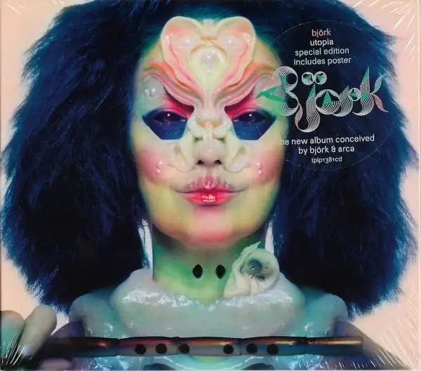
The cover was photographed by Jesse Kanda, with creative direction involving Björk and James Merry's prosthetic and mask work contributing to a character whose face has been reorganized through pearls, prosthetics, colour and forms that seem simultaneously botanical, aquatic and sexual.
The visual world surrounding Utopia is populated by flowers, flutes, birds, invented organisms and bodies that appear to be evolving into something beyond their existing anatomy. Where Vulnicura turns the body into the site of injury, Utopia imagines what that body might become after healing.
This is not utopia as clean modernist perfection. It is humid, decorative, biological and almost excessively fertile, presenting the future as something that grows rather than something that is engineered.
That distinction matters within the visual history of electronic music. Technology has traditionally been represented through hard surfaces: machines, grids, chrome, circuitry, computers and industrial architecture. Björk's later work increasingly proposes another possibility in which technological and biological imagery become inseparable. Digital manipulation can produce flowers, membranes, masks and impossible anatomy rather than the familiar iconography of the machine.
The face itself becomes a kind of interface between these worlds.
A conventional album portrait uses the face to guarantee identity, asking recognition to remain stable even as clothing and environment change. Utopia does almost the opposite. Björk remains recognizable precisely while the architecture of her face is being interfered with, demonstrating how far an established visual identity can move before recognition disappears.
For a musician whose image has been reconstructed with almost every album, transformation has become the continuity.
Björk Never Needed a Logo
Seen together, these five covers present a curious problem for conventional ideas about branding. There is almost nothing formally consistent between them. Homogenic is symmetrical, saturated and monumental, while Vespertine is pale, fragile and layered. Biophilia expands into cosmological diagrams and interactive systems, Vulnicura reorganizes the body around injury, and Utopia allows anatomy to mutate into an imagined biological future.
A conventional visual-identity manual might struggle to explain what connects them.
The connection exists at another level.
Björk has repeatedly treated each album as a world with its own internal rules, while allowing collaborators from graphic design, photography, fashion, film and technology to participate in defining those rules. M/M (Paris), Me Company, Nick Knight, Inez and Vinoodh, Alexander McQueen, Jesse Kanda, James Merry and many others have not simply supplied decorative material around an already complete musical identity; their contributions have helped determine how each period can be imagined.
This is why the collaborations matter. Björk's visual identity is highly controlled without needing to look permanently controlled by one person. The consistency is conceptual rather than stylistic. For musicians and graphic designers, this offers a considerably more interesting model of visual identity than simply repeating the same typography or logo across every release. Recognition can emerge through an approach to art direction, through a willingness to establish a new visual system whenever the music requires one, while certain deeper concerns continue beneath the surface.
In Björk's case, those concerns have remained remarkably persistent: the relationship between nature and technology, the transformation of the body, the instability of identity, the collision between ancient mythology and imagined futures, and the possibility that new technologies might create forms of intimacy rather than simply distance.
The tools changed alongside those questions. Photography became increasingly inseparable from digital manipulation, the record sleeve expanded into interfaces and applications, prosthetics altered the physical body before software altered the photograph, and eventually virtual environments made it possible for the visual world of an album to occupy space around the listener.
That may be the most useful lesson these covers offer contemporary album design. New tools inevitably produce new aesthetics, and every generation is tempted to mistake access to a new visual technique for the arrival of a new visual language. Björk's strongest artwork tends to avoid that trap because the technology is connected to a larger conceptual world before it is allowed to become spectacle. The question is never simply what the software can make possible.It is what kind of creature, landscape, mythology or identity needs that technology in order to exist.



Comments