


Five Michael Jackson Album Covers That Turned a Pop Star Into a Visual Symbol
Michael Jackson's album covers document something more complicated than the changing appearance of one of the most photographed people of the twentieth century. Across the period in which he moved from successful solo performer to a figure of almost unimaginable global recognition, the function of his image changed as well, and graphic design had to continually renegotiate what an album cover could possibly do with a face that millions of people already knew.
On Off the Wall, Jackson appears almost in full, dressed for the beginning of a new career; on Thriller, the visual noise is dramatically reduced and celebrity is expressed through an almost unnervingly controlled portrait; Bad turns clothing, typography and monochrome photography into an aggressive graphic identity; Dangerous largely removes the photographic body and replaces it with an illustrated universe of symbols, animals and machines, while HIStory enlarges Jackson into a monument, transforming the pop star into something closer to architecture.
The progression is not simply a history of increasingly expensive album campaigns. It reveals how photography, typography, fashion, illustration and image-making technology can respond to a changing problem of recognition. Once everybody knows what an artist looks like, the graphic designer no longer needs merely to introduce them.
The more interesting question becomes what that familiar image can be made to mean.
Off the Wall: Designing the Moment Before the Transformation

The original 1979 cover of Off the Wall presents Michael Jackson against a brick wall wearing a black tuxedo, white shirt, bow tie, black trousers, enormous Afro and glittering socks, while the handwritten album title sits casually above him. His body occupies almost the entire height of the sleeve, creating an image that feels remarkably direct compared with the elaborate visual mythology that would surround him only a few years later.
The wall provides more than a convenient background. Its repetitive brick structure creates a neutral grid against which Jackson's silhouette becomes immediately legible, while the black-and-white tuxedo establishes a visual contrast strong enough to survive the relatively informal character of the photograph. The sparkling socks introduce the one detail that seems almost too theatrical for the rest of the composition, concentrating attention near the feet of a performer whose movement was already central to his identity.
What makes the cover particularly interesting in retrospect is how much of Jackson it allows us to see. Later Michael Jackson imagery would become increasingly controlled, cropped, retouched, symbolic and monumental, but Off the Wall still depends on the body as a complete graphic form. The pose carries the composition, while fashion communicates a transition from the youthful image associated with the Jackson 5 toward an adult performer entering disco-era pop on his own terms.
The handwritten title works because it does not compete with this transformation. Rather than introducing an imposing logo, the lettering has the immediacy of something written directly onto the wall, allowing typography to participate in the environment instead of floating above it as corporate identification.
There is a useful graphic-design lesson here because nothing on the cover is technically complicated. Its effectiveness comes from proportion, silhouette, contrast and the relationship between a highly recognizable human figure and an extremely ordinary architectural surface.
Before Jackson's image became mythology, the design simply needed to give his body enough room to perform.
Thriller: When Simplicity Became a Form of Power
Considering what Thriller would become culturally, its 1982 cover is remarkably restrained.
Michael Jackson reclines against a dark background in a white suit photographed by Dick Zimmerman, looking directly toward the camera while the artist name and title appear relatively discreetly above him. There are no monsters, no references to the famous music videos that would later define the album's visual memory, and none of the elaborate symbolism that would characterize later Jackson artwork.

The cover's graphic power comes from an almost elementary contrast between white clothing, dark ground and skin, allowing Jackson's body to cut cleanly across the square. His pose creates a long diagonal through the composition, while the white suit occupies enough visual space to make the photograph recognizable even when reproduced very small.
That simplicity became increasingly significant as the album itself grew into a global phenomenon. Thriller did not need to explain Michael Jackson through graphic complexity because the image could operate through confidence and accessibility, presenting him less as an invented character than as an unusually polished version of himself.
The typography follows the same principle. It identifies rather than performs, allowing the photograph to remain dominant instead of attempting to manufacture an additional visual personality through lettering.
This restraint is worth emphasizing because iconic album covers are often remembered as if they needed an immediately spectacular concept. Thriller demonstrates the opposite possibility: when the subject already carries enough visual information, graphic design can become powerful through subtraction.
The subsequent videos for “Billie Jean,” “Beat It” and especially “Thriller” would create elaborate visual worlds around the music, but the album cover itself remains almost detached from that spectacle. It gives us the performer before the mythology surrounding the record explodes. In design terms, that creates an interesting division of labour. The videos construct worlds. The cover constructs recognition.
Bad: When Typography Became Part of the Character
Five years after Thriller, the cover of Bad presents a considerably harder visual proposition. Jackson stands against an almost completely white environment, dressed in black leather covered with buckles, zippers and metal hardware, while the album title appears beside him in large red graffiti-like lettering.
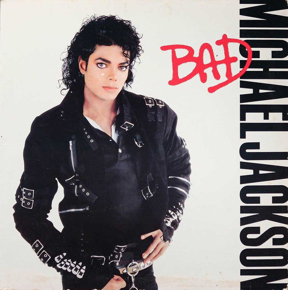
The transformation is immediate because almost every element operates through opposition. Black clothing sits against white space, the red title interrupts the otherwise monochromatic palette, the controlled studio portrait meets typography that appears quickly painted, and Jackson's narrow vertical body contrasts with the broad, gestural movement of the word BAD.
Unlike Thriller, where typography remains secondary to the photograph, Bad makes the title an active participant in the identity of the album.
The lettering does not merely name the record; it helps establish the attitude the photograph is attempting to communicate. Its apparent informality and association with graffiti introduce a language of the street into an image that is otherwise meticulously controlled, while the red functions almost like a warning mark against the black-and-white portrait.
Fashion performs an equally graphic role. The buckles, belts and metallic details fragment the black silhouette into a complicated network of lines and reflections, giving the clothing an almost mechanical quality. Jackson's costume is therefore not simply styling added before the photograph; it provides texture and visual rhythm within the composition.
This is one of the most useful ways to understand fashion in music graphic design. Clothing can operate as typography does, creating shape, contrast and repetition before any graphic element has been added to the photograph.
The cover is also an example of how an artist's visual identity can change dramatically without sacrificing recognition. The softness of the Thriller portrait has disappeared, replaced by a harder silhouette and a title that effectively announces the transformation.
The word Bad becomes both album name and graphic instruction. Everything surrounding it has been designed to make the claim believable.
Dangerous: When the Portrait Became an Illustrated Universe

The cover of Dangerous in 1991 breaks the logic established by the previous albums almost completely. Michael Jackson is still present, but only his eyes remain immediately visible, looking outward from behind an extraordinary painted structure created by Mark Ryden.
Around them unfolds a dense surreal environment of animals, cherubs, masks, crowns, machinery, theatrical ornament and miniature scenes whose relationships remain ambiguous enough to have generated decades of interpretation.
The shift from Bad is enormous. Photography no longer provides the primary language, the body has disappeared, typography has been absorbed into the architecture of the image and the cover demands prolonged looking rather than immediate recognition. Yet Jackson remains unmistakably at its centre. The decision to retain the eyes is crucial because they function as the point where celebrity portraiture meets symbolic illustration. Jackson can disappear behind an invented universe because the fragment that remains is recognizable enough to identify him, much as a designer can sometimes crop a familiar logo until only part of it is required.
Ryden's painting draws from a visual territory that includes carnival architecture, religious imagery, surrealism, historical ornament and commercial illustration, while the symmetrical composition gives this apparent chaos a surprisingly rigid structure. Jackson's eyes anchor the top centre, the title forms an arch below them, animals establish balance on either side and a dark passage pulls the viewer toward the miniature world occupying the lower half.
The density is therefore not random. It has hierarchy. This becomes particularly interesting when we consider how the image was made. Dangerous appeared at the beginning of the 1990s, when digital image manipulation was developing rapidly, but Ryden's central artwork was painstakingly painted rather than assembled as the kind of multi-layered digital composite its complexity might suggest to a contemporary viewer.
That production method changes how we understand the image. Today, an illustrator could generate, photograph, composite or manipulate dozens of independent objects before moving them repeatedly around a digital canvas. In a painting, the relationships between elements become physically embedded in the surface, making planning, drawing and composition particularly important before the final image exists.
The cover consequently sits at a fascinating technological threshold. Its visual complexity anticipates the unlimited compositing culture that software would soon make ordinary, while its production remains connected to a much older tradition of elaborate painted illustration.
Symbolically, Dangerous is equally unstable. Animals, royal imagery, childhood references, machinery and spectacle encourage interpretation, but the temptation to assign a definitive secret meaning to every detail misses something fundamental about the artwork. Its power comes partly from refusing to behave like a diagram whose symbols can be decoded once and then exhausted.
It constructs mythology rather than explaining it. By 1991, Michael Jackson's public identity had become too culturally enormous to fit comfortably inside another studio portrait. Dangerous responds by turning the portrait itself into a world.
HIStory: When the Pop Star Became a Monument
Four years later, HIStory: Past, Present and Future, Book I takes the problem of scale literally.
Instead of presenting Jackson as a photographed performer, the cover transforms him into a monumental silver statue, viewed from below against an atmospheric sky as though the listener were standing in front of the memorial to a historical figure rather than looking at the packaging of a contemporary pop album.

The perspective does much of the work. Looking upward makes the figure appear larger than the viewer, while the metallic surface removes much of the warmth normally associated with skin and turns the body into an object intended to survive beyond the person it represents.
The title reinforces this construction. HIStory is simultaneously history, his story and a piece of typographic wordplay that positions the album as a retrospective before the listener has encountered its contents. The cover therefore does not merely communicate grandeur; it makes a claim about cultural permanence.
This was extended far beyond the sleeve through the enormous statues created as part of the album's promotional campaign, in which Jackson's monumental image appeared physically in public spaces. The distinction between album artwork, advertising and spectacle became increasingly difficult to maintain because the same visual proposition could move from a CD cover to a giant three-dimensional object.
The campaign effectively asks what happens when visual identity becomes architecture.
From a graphic-design perspective, this represents an enormous distance from Off the Wall. There, a real body stands against an ordinary brick surface; on HIStory, the body has been transformed into an idealized object whose scale belongs to monuments, propaganda and public memory. Both images are about Michael Jackson. They make completely different claims about what that name represents.
From Face to Symbol to Mythology
Placed chronologically, these five covers reveal a transformation that would be difficult to see by considering each record in isolation.
Off the Wall uses Jackson's complete body as the principal graphic element, allowing pose, clothing and silhouette to establish an adult identity. Thriller simplifies the image into an exceptionally controlled celebrity portrait, relying on contrast and recognition rather than spectacle. Bad makes typography and fashion considerably more aggressive, allowing graphic language to participate directly in the construction of character. Dangerous almost removes the photographic performer altogether and replaces him with an illustrated symbolic universe, while HIStory reconstructs the body as a monument whose scale extends beyond the album itself.
What changes throughout this sequence is not simply Michael Jackson's appearance.
It is the amount of work his image is being asked to perform.
As recognition increases, the designer gains permission to manipulate it more radically. The complete figure can become a portrait, the portrait can become a fragment, and eventually the fragment can sit inside an image whose visual complexity would overwhelm a less recognizable artist.
This is one of the peculiar advantages of designing for extreme celebrity: recognition becomes material.
Jackson's eyes on Dangerous demonstrate the principle particularly clearly. They do not need a complete face beneath them because the audience supplies the missing information automatically, allowing illustration to occupy the space that conventional music marketing would normally reserve for the artist.
At the same time, these covers show why visual identity cannot be reduced to a logo or a recurring template. There is almost no formal system connecting the brick wall of Off the Wall, the photographic restraint of Thriller, the graffiti typography of Bad, Ryden's painted maximalism and the monumental CGI-like world of HIStory. Trying to force them into one consistent brand language would remove precisely what makes the sequence interesting.
The continuity is Michael Jackson, but the graphic design repeatedly changes the scale at which Michael Jackson is imagined.
First he occupies the cover. Then he dominates it. Eventually, the cover has to construct an entire world large enough to contain the idea of him.
Written by Otávio Santiago, a multidisciplinary designer exploring the intersection of emotion, form, and technology. His practice spans graphic, motion, and 3D design, bridging digital and physical experiences.



Comments