


US Government Typography: Why Calibri Was Dropped in Favor of Times New Roman
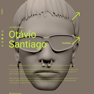
- Otávio Santiago
- 13 minutes ago
- 2 min read
The recent decision by the US State Department to abandon Calibri and reinstate Times New Roman has reignited a long-standing debate about US government typography and the role design plays in institutional identity. Officially framed as a return to tradition, the shift reveals how typographic choices extend far beyond legibility, entering the realm of symbolism, politics, and cultural signaling.

US Government Typography as Political and Cultural Design Language
Calibri, a sans-serif typeface designed by Lucas de Groot, was originally adopted to improve on-screen readability and accessibility. Optimized for digital environments, it reflected a broader move toward modernized communication systems within government institutions. Its replacement by Times New Roman — a serif typeface historically associated with formality and ceremony — reframes typography not as a functional tool, but as an ideological marker.
From a design perspective, this change highlights how US government typography operates as a visual language of authority. Serif typefaces, particularly Times New Roman, are deeply embedded in bureaucratic memory. They carry associations of permanence, hierarchy, and institutional continuity, even when they may be less suited to contemporary digital contexts.
Design researchers emphasize that typography is never neutral. Studies in communication design show that people consistently attach political and cultural meaning to typefaces.
Serif fonts are often perceived as conservative, traditional, and authoritative, while sans-serif fonts are associated with modernity, efficiency, and progress. In this context, the return to Times New Roman functions as more than an aesthetic preference — it becomes a visual declaration of values.

Critics of the decision argue that reframing accessibility-driven design choices as ideological “degradation” exposes a broader tension between function and symbolism. Calibri was selected precisely because it improved legibility for users with low vision, aligning with inclusive design principles. Its removal suggests a shift in priorities, where ceremonial consistency outweighs usability.
This typographic reversal aligns with a wider trend in US institutional design, where visual language increasingly reflects political narratives. From renewed interest in classical architecture to standardized digital interfaces, design decisions are being positioned as tools of identity reinforcement rather than neutral problem-solving.
In this light, US government typography becomes a case study in how design systems communicate power. Fonts are not merely carriers of text — they shape perception, reinforce ideology, and signal belonging. The Calibri-to–Times New Roman transition illustrates how even the smallest design elements can become charged symbols within cultural and political discourse.
Ultimately, the debate is not about which typeface is “better,” but about what typography is allowed to represent. When governments choose fonts, they are not just selecting styles — they are authoring visual narratives about tradition, authority, and the future of institutional communication.
Written by Otávio Santiago, a designer shaping narratives through motion, graphics, and 3D form. His approach merges emotion and precision to craft timeless visual identities and experiences.


Comments